APPLICATION + ENHANCEMENT
Reimagining car insurance: Launching Sonnet Shift
New type of insurance
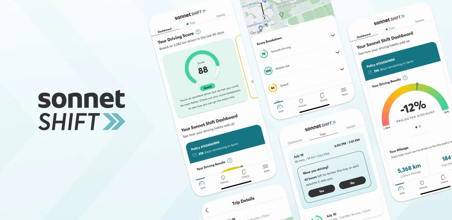
In September 2023, Sonnet Insurance launched Sonnet Shift to meet the growing demand for usage-based insurance (UBI). This marks a significant change from the traditional insurance model. The new product uses a data-driven approach to generate quarterly premiums depending on the user driving habits. However, this comes with its own challenges. Most customers are not familiar with how UBI works or what it requires. To address this, the team aimed to simplify the experience and educate users along the way. We added personalized driving insights and clear, easy to understand tooltips to help customers understands their driving behaviour and how it impacts their premiums.
Team
Designer 🙋🏻♀️, copy writer, UX research, data analysts, product owners, developers, underwriting team.
My role
Sole designer: design, UX technical requirements, QA and support through launch.
Taking ownership of Sonnet Shift
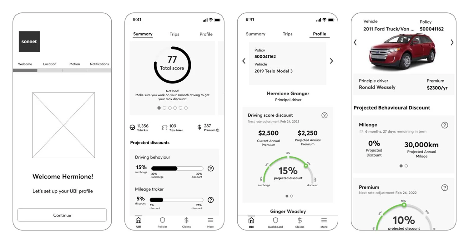
I collaborated with various teams for over a year to help bring Sonnet Shift to life. I turned complex product requirements into clear, user-friendly experiences. The Shift project had multiple workstreams. The marketing team focused on how to promote the new product. Another team worked on introducing and educating users about Shift within the quote flow. I led the design of the Shift landing page, working closely with a copywriter.
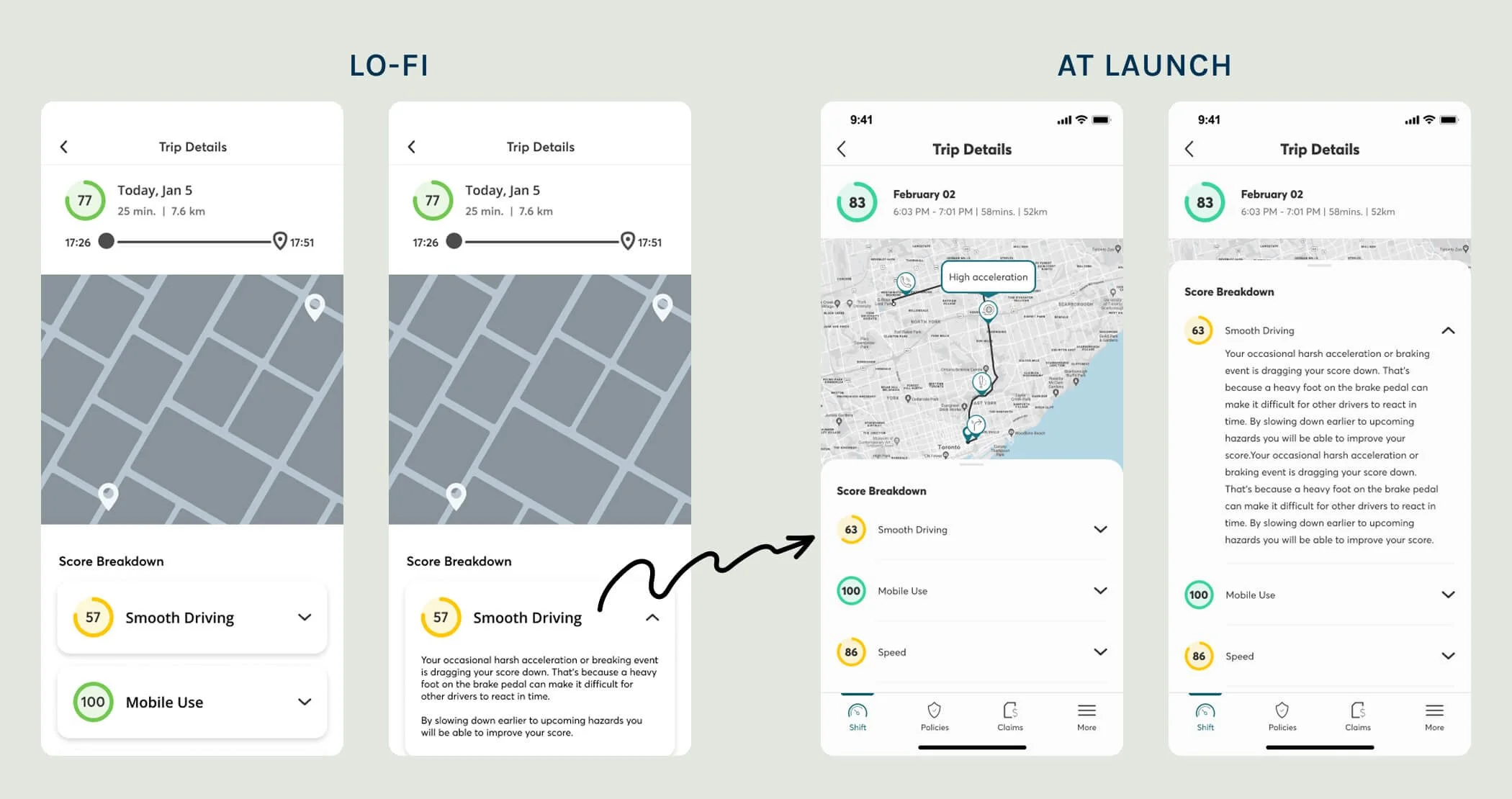
Although I had no prior experience designing mobile apps, I also took on the role when the original app designer left early in the project. I quickly learned as much as I could and as fast as I could while taking full ownership of the app experience. I led the design, iteration, and improvement of the entire app journey, from driving score breakdowns to trip insights. My goal was to make the app feel intuitive, while ensuring that it meets the underwriting requirements.
The stage the project when I took over:
Learning on the fly: Project challenges
🧠 Translating technical requirements into user-friendly experiences
Collaborating with the underwriting team had its challenges. Their requirements often included jargons and unfamiliar UX behaviours that didn’t match user expectations. I worked closely with them to bridge this gap, pushing for familiar interactions without compromising compliance.
⏲️ Designing under tight timelines
The aggressive timeline limited how much we could improve usability. I proposed features like batch trip management (accept/decline multiple trips at once) and vacation mode to provide more control and flexibility, but these were deprioritized for launch. While not all ideas made it into the MVP, we designed the experience with scalability and future updates in mind.
💭 First-time mobile app design and platform differences
This was my first time designing for a mobile app, and my knowledge of app development, especially platform specific behaviour was limited at first. Although I did as much research as possible, I quickly learned that iOS and Android often required different design considerations. Some interactions didn’t work well across both platforms, so we had to find alternate solutions. We aimed to rely on native behaviours wherever we could. I also prioritized building strong relationships with two go-to developers (one for each OS) who I could regularly consult to mitigate risk and check feasibility.
Challenges → launch
Over the course of a year, I worked closely with our content writer to finish the app. We went through many rounds of ideas that were rejected, reworked, or discarded. The Underwriting team heavily influenced this project, which limited the role of design and content. This often felt restrictive. However, these challenges pushed me to be creative within the limitations. Despite it all, we pushed through and launched successfully. We met all requirements while still providing a cohesive and thoughtfully designed experience.


Post-launch app iteration & enhancements
Prior to launching Sonnet Shift, the team recruited approximately 30 internal staff members to test the app. Although this gave us useful insights, launching this to the public was important to gauge interest and discover customer pain points. Like any MVP, some features needed to be deprioritized to meet deadlines. However, we've kept refining the product based on feedback and data.
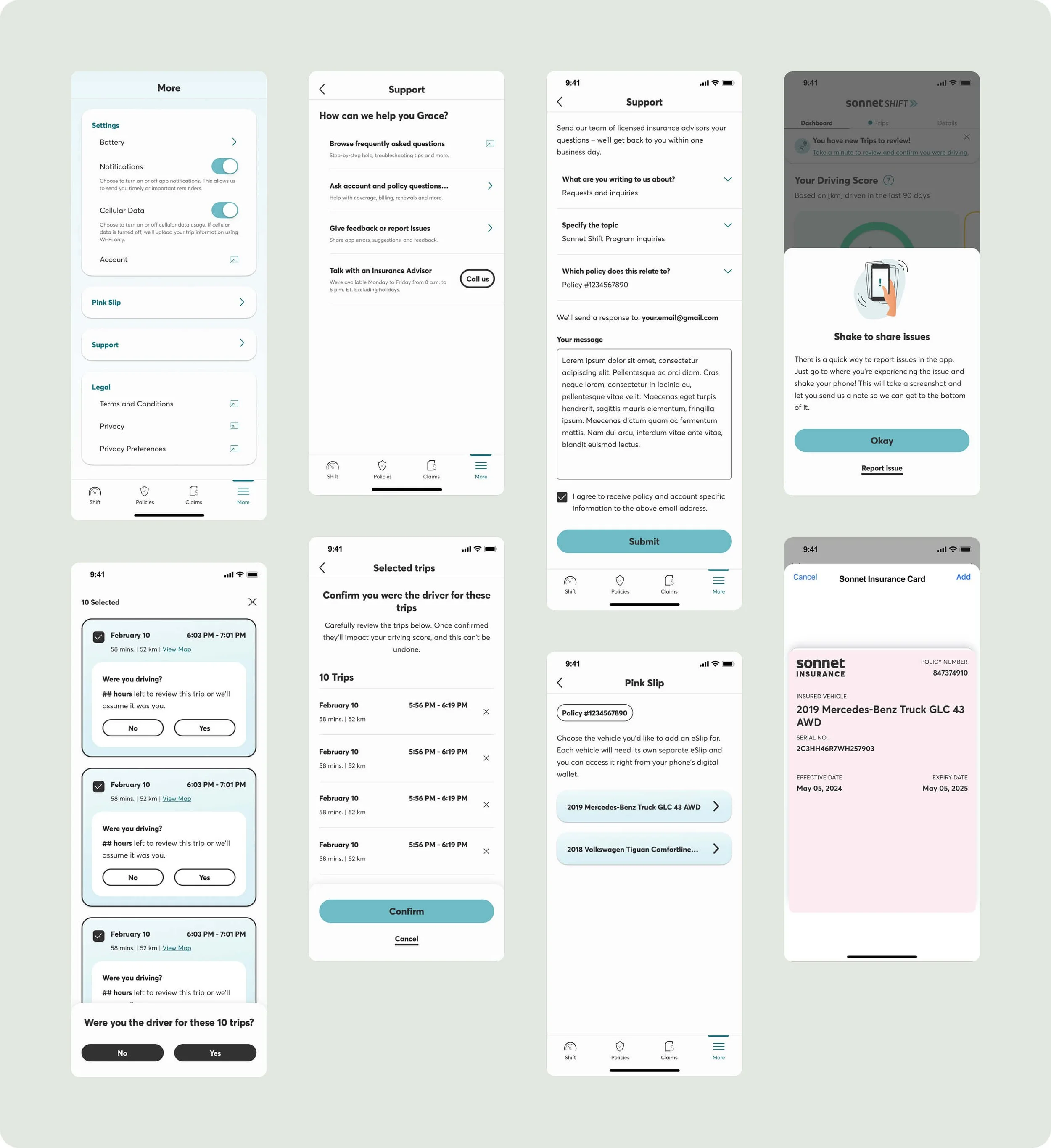
Since the launch, I’ve worked closely with the product owners, underwriting team and customer support team to improve the app experience and address known issues. One of our first improvements was adding a feedback feature in the app. This lets users report technical problems, ask policy-related questions, and connect directly with Insurance Advisors.
Enhancements I lead:
Digital e-slips (What is an e-slip?)
Enabled all auto policy customers to download and access their proof of insurance directly in the appSupport section in the app
Designed and launched in-app support hub, including:Frequently Asked Questions (FAQs)
A contact form for account and policy inquiries
An option to give app feedback or report issues
A ‘Call Us’ button for immediate help from an advisor
Enhancements I oversaw:
While not directly responsible for the design, I provided guidance and feedback for the following initiatives:
Batch trip management — Users can now accept or decline multiple trips at once
App rating prompt — A native pop-up to encourage App Store reviews
Tooltip feedback — “Was this helpful?” microinteractions to gather data and learning
Native dashboard experience — Replaced webview with a fully native dashboard experience to improve user engagement
Wait, what did I just buy? Fixing user confusion around Shift in the quote flow
Less than a year after launch, the Business Insights team ran a consumer research study to understand how customers were interacting with Sonnet Shift, and why some weren’t sticking with it. Some questions we needed answers to:
How can we boost adoption of the Shift app after policy purchase?
What’s preventing customers from activating their policy?
Why are some users switching back to Traditional, and how does that affect retention?
How do users feel about the app overall and how can we improve it?
What we found
UBI is still unfamiliar territory
Most drivers in Ontario aren’t familiar with usage-based insurance. Only 34% had even heard the term. Of those who had:74% thought it was only about how much you drive
Only 5% understood that it involved tracking driving behaviour
Many assumed it could save them money but didn’t realize it could also lead to a higher premium
Privacy and tracking concerns are a major barrier
When asked why they didn’t want to enroll:Many said they didn’t feel comfortable being tracked
Others were unsure how their data would be used or protected
Some didn’t want to stress about their driving affecting their premium
Most users don’t fully understand what they’re signing up for
23% of customers who purchased Shift didn’t realize they needed an app
During the quote flow, 60–70% of users didn’t read the information provided about Shift
65% thought UBI only related to mileage
30% couldn’t recall choosing Shift over Traditional in the quote flow
3 out of 10 customers didn’t understand how Shift worked when they purchased it
Key areas where users need to be educated on:
That premiums can go up or down, depending on driving behaviour
That they must activate their Shift policy or it defaults to Traditional
That pricing is updated quarterly, not annually like most insurance
What users don’t understand about Shift
Ultimately, the research showed that many users were selecting Shift because of the lower upfront price but weren’t aware of the program’s requirements or how it worked. This led to confusion and lack of app activation.
Problems we need to solve:
Users don’t realize they’re signing up for Sonnet Shift
Users don’t know Shift requires an app to stay enrolled
Users aren’t aware that the premium is dynamic and may increase
To address this, I partnered with a content writer to overhaul the quote flow experience to help users make informed decisions. Our focus was on clarity, transparency, and to reduce cognitive load. The original Package Select page at launch:

The UI above was worked on by another designer
What we did:
Reworked the content layout to guide users through the information more naturally
Simplified explanations of Shift using visual cues and bite-sized content
Removed the terms ‘Shift’ and ‘Traditional’ and replaced them with clearer, more user-friendly language
Made the difference between Shift and Traditional more obvious through clearer comparisons
Moved the prices to the bottom of each card to reduce bias toward the cheaper option and encourage users to read and understand the differences before selecting
Highlighted the app requirement earlier and more prominently and repeating it throughout the flow to ensure users saw it multiple times before purchasing
Introduced a learning modal after Shift selection to clearly communicate requirements (app, tracking, device, scoring) before user lands on the coverage selection page

Post-launch wins 🥳
The updated quote flow led to meaningful improvements in user understanding and behavior:
App activation increased by 5 points in Ontario and 9 points in Quebec within the first two weeks
Reached our 90% activation goal within 30 days
The split between product selections shifted from 50/50 (Traditional vs. Shift) to 70/30, with more users intentionally choosing Traditional. While Shift purchases went down, this shows better user understanding. Customers now select the product that best meets their needs. This leads to fewer cancellations and switches after purchase
Third Time’s the Charm?
We simplified the auto quoting experience by changing confusing dual pricing to a single, personalized package view. By introducing a Shift opt-in question early in the flow, we can show the right options when user lands on this page. We show traditional packages to customers who opt out of usage-based insurance and Shift packages to those who opt in. The result is a flow that’s easier to understand, and allows for future improvements like targeted bundling and product recommendations.
Hypothesis 🤔
By confirming customers' interest in Shift and presenting one auto quote package at a time, we will see more customers select Sonnet Shift.
1️⃣ Primary metric
Q2B (quote to bind)
Product mix
Shift adoption %
2️⃣ Secondary metric
How many users are unchecking the question box
How many users are toggling packages
Product chosen vs. checkbox state
Price difference when user switched packages

Results
83% of customers leave the checkbox in its default state (checked)
Regardless of the state of the checkbox, on the package page, most customers (>85%) do not toggle between price options
Customers who see Shift quote first bind Traditional 48% of the time, despite higher Traditional premiums. This is more pronounced in QC where 70% of customers shown Shift first are binding Traditional.
Customers who see Traditional quote first bind Shift only 6% of the time despite Shift price being lower
New business auto mix has shifted significantly toward Shift in ON (47% vs. 30% pre-release), but overall auto binds have remained largely unchanged, suggesting that Shift is primarily displacing traditional auto business rather than driving growth
While this version improved clarity in the experience, the results suggest we haven’t fully reached the behaviour change we wanted. Customers still stick to their initial preferences. They show little interest in comparing options, even when there are significant price differences.
Given these patterns, this remains as an open issue. We will keep monitoring performance and review the experience, focusing on improving product framing, timing, and user intent. Future iterations will likely need to go beyond simple fixes and tackle the deeper trust and perception gaps of usage-based insurance.